
GRTFL Case Study
GRTFL
Back to Case StudiesThe challenge
We needed to take Grtfl’s brand identity and give it purpose. This project was about challenging the norm; creating a personality and evolving the identity to engage audiences.
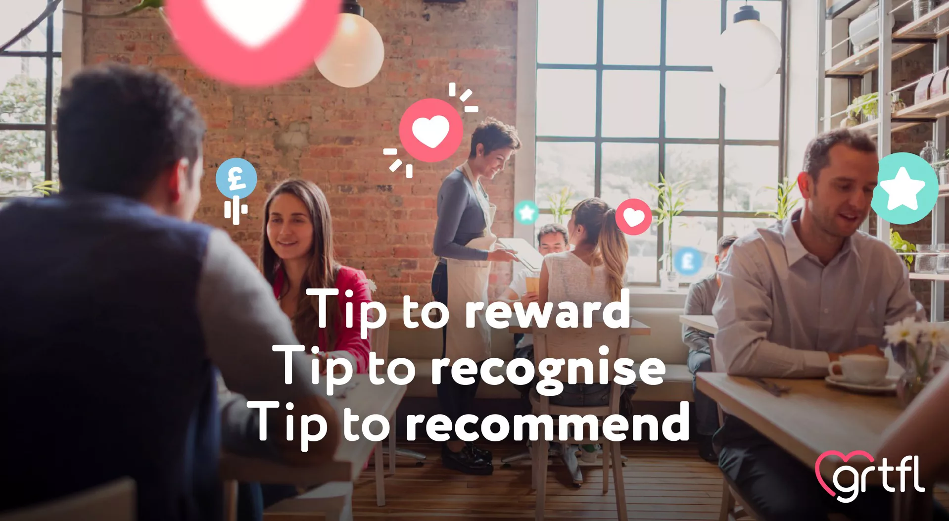
We focused on celebrating great customer service to bring an emotional aspect to a functional/tech process.
The approach
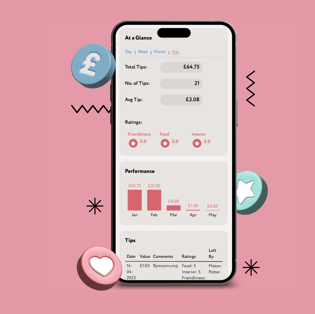
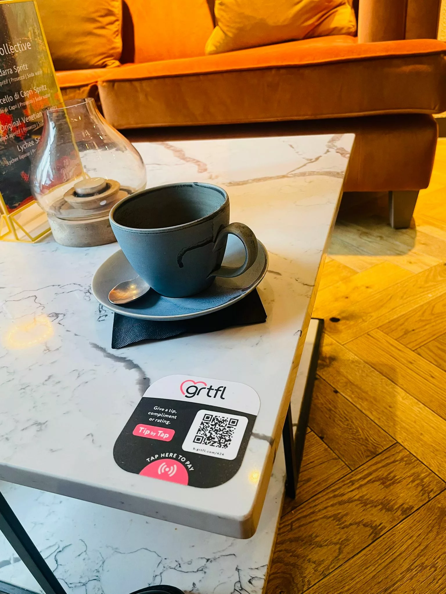
In order to demystify the perceptions around cashless tipping, we built a positioning and purpose that centred around educating the audiences as the brand was built – helping businesses to scale with confidence.
We took time with the team to understand the varying audiences for the tipping platform and how their unique features and benefits would work for each of them.
We transformed a logo into a fully-fledged brand that reflects the vision and sentiment of the team behind it – a business built on connection, celebration and positivity.
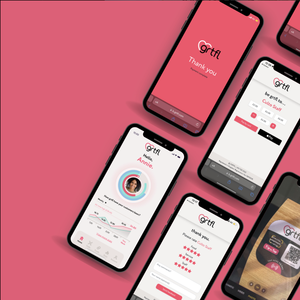
The solution
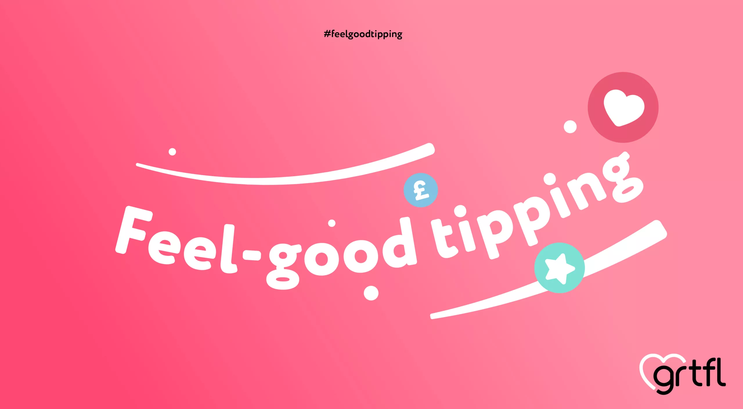
Making tipping feel good for everyone that connects with the brand. Building out the platform, the onboarding process, and the communications to be as engaging as the service offered.
Challenging the category with a brand full of personality, as well as function, that creates a movement… and becomes the norm in our cashless society.
…Ultimately, we ensured Grtfl’s essence was all about appreciating the art of great customer service – simply.
Ready to dig deep?
Let's Talk